LITTLE BARN APOTHECARY
BOX PACKAGING
Little Barn Apothecary finds inspiration in the natural, holistic, vegan, and organic ingredients that make up their products. When learning about their formulation process and using the products myself, what I found significant was the importance of transparency in the brand. Consumers trust their physical well-being with these products and it was critical to the founders to inform and educate their consumers on what and why they were applying specific ingredients.
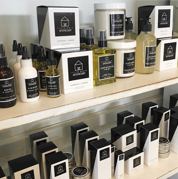
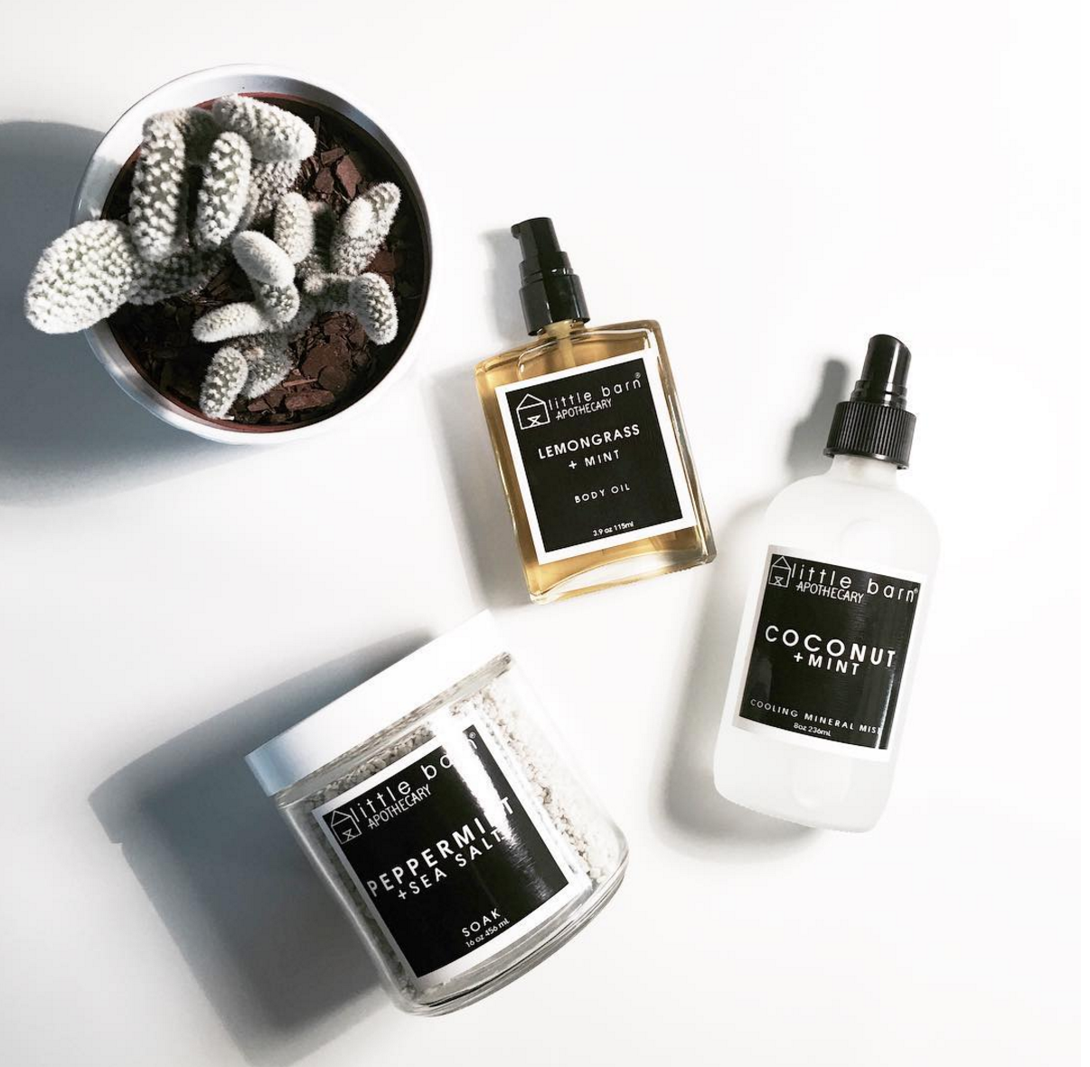
LBA desired packaging designs that visualized this transparency and embodied their core attributes of simplicity, minimalism, and uncomplication. My strategy in approaching a solution was to explore this concept of an overarching core, housing ingredients within while simultaniously communicating the LBA promise of keeping it transparent.
The name of the brand, Little Barn Apothecary, references the simple and beautiful ways of a southern, self-sustainable lifestyle. It was created with that same deep passion. I wanted to pay homage to that in the design, so I incorporated the same angles and shapes the logo is recognized for, referencing the architecture of a small barn while keeping that reference subtle, modern, and minimal.


